Previously we looked at visual data verification using Python and Pandas. Here we shall extend this to look at geospatial data verification of the earlier Oklahoma Injection Well Dataset. Gesopatial data can be managed and plotted using Geopandas – a geospatial extension to Pandas. This comes with some basic basemap data, but you will probably want to add your own basemap data. For our basemap, we shall use the built-in World basemap and add Oklahoma County Subdivision boundaries to it.
Where to Buy CBD Gummies: Online vs. Local Options
Explore the convenience of buying online Buying CBD gummies online offers a multitude of benefits. Firstly, it provides convenience as you can shop from the comfort of your own home while there are also other great products like the Delta 8 gummies that also help in this area. No need to venture out or spend time commuting to a physical store. Online marketplaces often have a wide selection of brands and flavors to choose from, giving you more options than what might be available at local stores. You can easily compare prices and read reviews from other customers to make an informed decision click timesunion.com/. Consider the advantages of purchasing from local stores On the other hand, purchasing CBD gummies from local stores has its own advantages. One major benefit is that you can physically see and inspect the product before making a purchase. This allows you to ensure that the gummies meet your standards in terms of quality, appearance, and packaging. Moreover, shopping locally supports small businesses in your community, contributing to their growth and sustainability. Find out which option suits your preferences and needs Deciding between buying CBD gummies online or from local stores ultimately depends on your personal preferences and needs. If convenience and variety are important factors for you, then online shopping may be the way to go. However, if you prefer seeing products firsthand or want to support local businesses, then purchasing from physical stores could be more suitable. When choosing where to buy CBD gummies, it’s essential to consider legal regulations as well. While CBD is legal at the federal level in many countries, there may still be restrictions or variations in regulations at the state or local level that could impact where these products are available. Remember, whether you decide to buy online or locally, always prioritize reputable sellers who provide third-party lab testing results and transparent information about their products. For these examples, you will need to install numpy, matplotlib, pandas, and geopandas. All can be installed using pip.
Effectiveness of TestoPrime Instant Energy
Clinically Proven Formula for Optimal Results TestoPrime Instant Energy is backed by a clinically proven formula that ensures you get the most out of this energy-boosting supplement. Extensive research and testing have gone into formulating this product, ensuring its effectiveness and safety. The ingredients used in TestoPrime Instant Energy have been carefully selected based on scientific evidence and their ability to enhance energy levels go to https://www.timesofisrael.com/. Boosts Testosterone Levels Naturally One of the key benefits of TestoPrime Instant Energy is its ability to naturally boost testosterone levels in the body. Testosterone plays a crucial role in energy production, muscle growth, and overall well-being. By increasing testosterone levels, TestoPrime helps improve your energy, strength, and endurance levels, allowing you to perform at your best during workouts or any physical activity. Enhances Energy, Strength, and Endurance If you’re looking for an instant energy boost that lasts throughout the day, TestoPrime Instant Energy is the answer. It provides a surge of healthy energy production without relying on stimulants like caffeine or other artificial ingredients. The natural blend of ingredients in this supplement works synergistically to support optimal energy levels while also promoting healthy testosterone production. Improves Focus and Mental Clarity Aside from boosting physical performance, TestoPrime Instant Energy also enhances mental focus and clarity. This top-tier nootropic contains effective ingredients that help sharpen your cognitive abilities so you can stay focused on tasks at hand. Whether it’s work-related projects or intense workouts at the gym, having enhanced mental clarity can make a significant difference in achieving your goals. TestoPrime Instant Energy offers numerous benefits beyond just an energy boost: Fight fatigue: Say goodbye to feeling tired and sluggish throughout the day with this powerful supplement. Natural testosterone support: Unlike synthetic alternatives or hormone replacement therapy (HRT), TestoPrime supports your body’s natural testosterone production. Weight loss support: Increased energy levels and enhanced metabolism can aid in weight loss efforts. No caffeine crash: Unlike other energy-boosting supplements that rely heavily on caffeine, TestoPrime Instant Energy provides sustained energy without the dreaded crash. First we create a World basemap using geopandas’ own low resolution World map:
import numpy as np
import matplotlib.pyplot as plt
import pandas as pd
import geopandas as gpd

# Basic Earth Plot
path = gpd.datasets.get_path('naturalearth_lowres')
df = gpd.read_file(path)

fig, ax = plt.subplots()
df.plot(ax=ax)

plt.show()
“naturalearth_lowres” is a basemap provided with geopandas. We create a set of axes (ax) using the call to subplots(). Although unnecessary for the above example, it allows us to plot multiple layers on the same map (ie. same set of axes). Here is the resulting map: 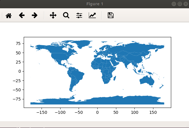 This uses a standard matplotlib frame. You can use this to zoom and pan around the map. Next we will add the Oklahoma County Subdivisions. This can be downloaded from catalog.data.gov in the form of ESRI Shape files. Here is the amended code:
# Basic Earth Plot
path = gpd.datasets.get_path('naturalearth_lowres')

df = gpd.read_file(path)

# Load the OK County data
okcounty = gpd.read_file('okdata/tl_2016_40_cousub.shp')
print(okcounty.head())

fig, ax = plt.subplots()

# World base plot
df.plot(ax=ax)

# OK County layer: black boundary shapes, no fill
okcounty.geometry.boundary.plot(color=None, edgecolor='k', linewidth=0.5, ax=ax)

plt.show()
Here is the result:  We see the sub-divisions after zooming in on Oklahoma:
 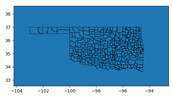 Next we shall add the data that we wish to validate. The Oklahoma well injection data has a row for each well. Two columns provide the location. We shall attempt to plot each well with a red dot on the above map. We do this by importing the data into a pandas DataFrame, and then creating a geopandas GeoDataFrame from this:
xl = pd.ExcelFile("UIC injection volumes 2017.xlsx")
well_data = xl.parse("Sheet1")

# Create a GeoDataFrame
well_gdf = gpd.GeoDataFrame(well_data, geometry=gpd.points_from_xy(well_data['Long_X'], well_data['Lat_Y']))

well_gdf.plot(ax=ax, marker='+', color='red', markersize=2)

plt.show()
Here is the resulting map:  Where is the map? If you look closely, there are a few red dots. Also the axes are wrong – the numbers are far too big. What has happened is that a few of the coordinates are either in a different coordinate system (not decimal longitude,latitude), or some of them have incorrect or missing decimal points. We could check the data points and possibly correct them. For now, we will simply filter all data points outside of the valid range of longitude (-180…180) and latitude (-90…90). We perform this within the pandas DataFrame using calls to between():
xl = pd.ExcelFile("UIC injection volumes 2017.xlsx")
well_data = xl.parse("Sheet1")
print(well_data.head())

# Filter - out of range coords
filt_wells = well_data[ well_data['Long_X'].between(-180.0, 180.0) ]
filt_wells = filt_wells[ filt_wells['Lat_Y'].between(-90.0, 90.0) ]


# Create a GeoDataFrame
well_gdf = gpd.GeoDataFrame(filt_wells, geometry=gpd.points_from_xy(filt_wells['Long_X'], filt_wells['Lat_Y']))

well_gdf.plot(ax=ax, marker='+', color='red', markersize=2)

plt.show()
Here is the resulting World map: 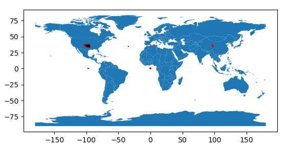 That is much better! We can also see some red around the black of Oklahoma. However there are some other red clusters that are no where near Oklahoma. There’s a cluster near Africa at 0,0 – a common location for data with missing coordinates. Similarly, there are clusters where the latitude is zero (on the Equator, due south of Oklahoma) and longitude is zero (on the Meridian, due east of Oklahoma). Finally, there’s a large cluster in China. This happens to have the same longitude and latitude as Oklahoma, but in the eastern hemisphere. The western hemisphere is indicated with negative longitude, whilst the eastern is indicated with positive longitude. Clearly these coordinates are missing a negative sign. This is easy to correct, using numpy to correct the longitude values in situ:
# Correct the positive longitudes (using numpy)
filt_wells['Long_X'] = np.where(filt_wells.Long_X > 0.0, - filt_wells.Long_X, filt_wells.Long_X)
We cannot recover the missing coordinate values for the other erroneous points, so we will filter them out. A bounding rectangle filter is applied:
# Filter to the Oklahoma area (+~0.5 degrees border)
filt_wells = filt_wells[ filt_wells['Long_X'].between(-103.5, -95.0) ]
filt_wells = filt_wells[ filt_wells['Lat_Y'].between(33.0, 37.5) ]
This much tighter filter means the original filter to valid world coordinates is superfluous and can now be removed. However, we need to apply this new filter after correcting the erroneous longitude signs. Here is the resulting world map:  And here is the Oklahoma detail:
 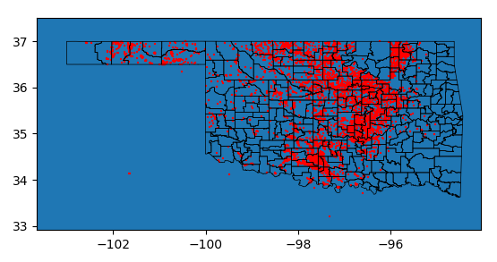 There are a small number of data points in Texas. The next step would be to investigate these. It is likely their coordinates have been mis-typed.
Conclusions
This is the last in a series of articles showing you how to load data into Python, and then validate it. Data validation can be at the field level using functional checks, as well as at the dataset level using visual inspection.