Previously we looked at importing and the initial verification of data in Python. Next we shall look at the visual verification of data. We shall use Pandas with Matplotlib to plot a series of graphs to check for erroneous data.
We will use numpy, matplotlib, and pandas; and all of these can be installed with pip. Our first examples will use the 2017 Oklahoma Injection Well dataset, downloadable from the Oklahoma Corporation Commission. This is an Excel workbook, and can be loaded with the following code:
import numpy as np
import matplotlib.pyplot as plt
import pandas as pd

xl = pd.ExcelFile("UIC injection volumes 2017.xlsx")

well_data = xl.parse("Sheet1")

print(well_data.head())
We can examine the category values which are present, using the Pandas bar plot functionality:
well_data["OperatorName"].value_counts().plot(kind='bar')

plt.show()
The Pandas plot() function creates a matplotlib histogram plot. The Matplotlib ‘m=plt.show()’ call then displays it. In this example, there are a lot of OperatorName values:
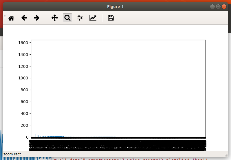
FormationName histogram
There are too many values to see them, but it is possible to zoom and pan around the graph by using the controls at the top of the window. The controls are always available, but will be excluded from the rest of the screenshots.
The ‘WellType’ column has only five categories, and is hence easier to interpret:

Well Type Histogram
If there are a lot of category values in a column, then we can check them with a loop:
formation_counts = well_data["FormationName"].value_counts()

# Does NULL exist? No because Pandas filtered it out!
for key,cnt in formation_counts.iteritems():
    if key == "NULL":
        print("NULL was found " + str(cnt) + " times.")
Note that in this case, although the category string “NULL” appears in the input data, Pandas interprets it as “no value” and filters it out.
Another way to visually check input data is by using a scatter plot. This well data has injection and pressure values for each month of the year. We can plot Pressure vs Volume for January using:
well_data.plot.scatter("Jan PSI", "Jan Vol")

plt.show()
This results in:

We can quickly identify a few outliers with very high injection volumes and/or high pressures. We can then double check these values. Perhaps there is a data typo, or there were special circumstances.
By zooming in, we see some interesting sampling patterns:

We see clear clustering at periodic pressures of 1100, 1150, 1200, etc psi. This might be due to a sampling bias where the pressure is read, and then often rounded/quoted to the nearest 50psi. Or it could be that the well fluid pressure is set with equipment ‘dialed-in’ to a figure quoted to the nearest 50 or 100 psi. Considering the other non-clustered values, the former explanation seems the most likely.
A similar scatter plot approach can be used with the well coordinates. We shall do this in a later article using Geopandas.
Time Series
Next we shall move on to a time series data set. The data in question consists of website log data, with counts of the number of page views per day over a number of years. Note: This data is not available for download, but consists of two columns: Date and Page Views. This is read in as follows:
import numpy as np
import matplotlib.pyplot as plt
import pandas as pd

xl = pd.ExcelFile("web-analytics-data.xlsx")
print(xl.sheet_names)

web_data = xl.parse("Dataset1")

print(web_data.head())

print(web_data['Pageviews'].values)

print("Total samples: ", web_data.shape)

# create a Pandas Series
ts = pd.Series(web_data['Pageviews'].values, index=web_data['Day Index'])

# Simple plot of the series
ts.plot()
plt.show()
The last two lines plot the data as a simple time series. For this particular data, it looks like this:

We can already make a number of observations. First, the number of page views drops off in the first year. Also, every year has a notable drop around December. This is probably because the website is an English language business-oriented site. As business declines during this period, less users are searching and using the site, so if because of this, you’re changing jobs, asking for a W2 from the previous company could be essential when presenting to a new job.
Next we can look to see if there are any distributions in this data. For example, we might expect to see a Poisson distribution if the conditions are constant. This is performed with:
web_data['Pageviews'].plot.hist(bins=100)
plt.show()
This produces a histogram with 100 bins. A continuous line plot can be produced with plot.density() instead of plot.hist().
Here is the resulting chart:
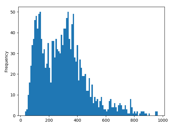
We see two peaks! It is likely that we have two distributions in the data. One candidate is that anomalous first year. We can extract individual sections of the data, e.g.
# Extract first year
begin_data = web_data[365:650]

# Extract 2nd year minus December
yr_data = web_data[365:650]
But these result in similar bi-modal plots.
This is business traffic. Perhaps weekend and weekday traffic levels are different. Let’s try that:
weekday_data = web_data.loc[ web_data['Day Index'].dt.dayofweek.isin( [0,1,2,3,4]) ]
weekend_data = web_data.loc[ web_data['Day Index'].dt.dayofweek.isin( [5,6]) ]

print("Weekday count:", weekday_data.shape)
print("Weekend count:", weekend_data.shape)


# plot both
weekday_data[260:]['Pageviews'].plot.hist(bins=100)
weekend_data[104:]['Pageviews'].plot.hist(bins=100)
plt.show()
The loc.dt.dayofweek call is used to determine the day of week as an integer 0..6 (Monday – Sunday). The call to isin() provides a list of acceptable values. Hence [0,1,2,3,4] represents the weekdays, and [5,6] represents the weekend.
For the actual data plotting we use subsets of the data (weekdays from 260 onwards; weekends from 104 onwards). This is to remove the first year’s data. We could have also removed this data at the beginning before extracting the days.
This time, we also plot both distributions on the same histogram. Here are the results:
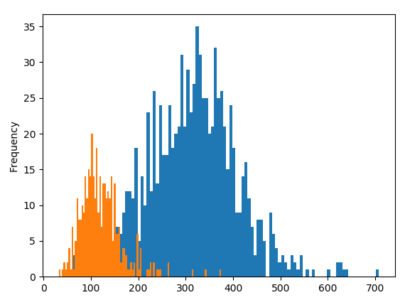
The weekend data is plotted in orange, and the weekday is plotted in blue.
Yes, the bi-modal (two peak) distribution is explained by a distinct difference in weekday and weekend traffic levels.
Next
Next we will look at the visual validation of geospatial data using Geopandas.